Hard Evidence of 85% plus success
“Andrew’s evidence of recovery/improvement is a staggering 88% (of all he sees for two or more sessions) – a match for the very best of national data (of all therapists nationwide for which there is data).” Bill Andrews, Director of the Human Givens Practice Research Network

Each client fills in a questionnaire at each session – with the exceptional improvement by over 85%
For over ten years now, most of my clients have evaluated their progress at each session of therapy, by completing a short questionnaire. This gives me an objective measure of their emotional health/distress over the previous week.
Over 87% of clients who come for two sessions or more (and therefore provide a measure of change) show significant improvement or complete recovery. The current numbers (to Dec 2020) are over 1000 improved/recovered clients out of a total of 1200.
What this means
- 85% plus is a very high number compared to the many studies undertaken for all types of counselling
- This can give you real confidence and hope if you are considering making contact
- These results give me confidence and this transmits to my clients and helps the healing process
- During therapy, we can together monitor progress – and so know when there is little or no improvement and then change tack if necessary
- At the end of therapy, we can see the extent of progress and improvement – which may surprise you
The inspiration for introducing outcome measures to evaluate my client’s progress was Scott Miller. Read of his extraordinary conclusions. What was it that Scott Miller demonstrated was successful counselling?

The average number of sessions was 3.3.
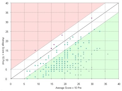
The CORE system of evaluation is used:
Green dots on green background = significant improvement
Green dots on white background = modest improvement
Red dots on white background = worsened moderately
Red part of the graph = worsened significantly
The horizontal measures the CORE score at the first session
The vertical measures the CORE score at the final session or from follow up.
Scores below 10 measure good emotional health and recovery.
From 10-15 is mild distress
From 15-20 is moderate
From 20-25 is moderately severe
Above 25 is severe
The graph shows the results of clients scoring how they felt at the beginning of at least two sessions. This gives a comparison of before and after changes. The results have been collated from completed evaluations of 250 clients during a three year period.
Do you see the green dots on the green background? These are the clients who improved by a significant amount (more than 5 points) or completely recovered (to a score of less than 10). These green dots are over 85% of the total.
There are a few dots (red and green) close to the sloping central line. These are the clients who did not change over the therapy by a meaningful degree. Many scored a little better and a few scored a little worse.
Those dots closer to the right side represent clients who came to me highly distressed while those toward the left-hand side were less distressed at their first session.
There is just one red dot on the red background. This means that over this period, there was one client who was feeling significantly worse at the final session. Fortunately her level of distress both before and after was quite low.
Evidence for the Human Givens approach
In 2011 The British Psychological Society’s leading peer-reviewed journal, Psychology and
Psychotherapy: Theory, Research and Practice published a 12-month evaluation of the Human Givens approach in primary care at a general medical practice.
The result showed that more than three out of four patients were either symptom-free or reliably changed as a result of HG therapy*. This was accomplished in an average of only 3.6 sessions, significantly better than the recovery rate published for the UK government’s flagship IAPT (Improving Access to Psychological Therapies) programme, which uses therapists trained in cognitive behavioural therapy (CBT).
The complete evidence base supporting Human Givens
A service evaluation of veterans
A five-year study using a practice research network – with thousands of real-life cases.
The Latest evidence of Human Givens effectiveness: on the Psychology Today website
How we know Human Givens therapy works